Logo guidelines
This guide contains our wordmark, favicon and WRH symbol and its applications. How-to, examples in use and co-branding are detailed in the link below.
Wordmark
Overview
At Ferag, our brand is more than just a logo or color palette. It’s the visual and emotional expression of who we are, where we come from, and what we stand for across countries, cultures, and industries.
Every presentation, email, brochure, or exhibition stand is an opportunity to make Ferag recognizable, trustworthy, and inspiring. That’s why our Corporate Identity (CI) and Corporate Design (CD) are not just design rules, they are tools for consistency, credibility, and pride.
Following our brand guidelines is not just a marketing task, it’s a shared responsibility. It strengthens our message, supports our employer brand, and shows the world that we’re one team, working with one voice.
01 Logo
The name Ferag is formed from the founders’ original company name: Fehr and Reist AG. It reminds us of our roots while standing today for:
- Swiss engineering excellence
- Innovative intralogistics solutions
- Trust, reliability, and forward-thinking
Our visual identity consists of two core elements:
Set in the Frutiger typeface, a world-renowned font designed by Swiss typographer Adrian Frutiger. This clean, modern typeface symbolizes Swiss precision, clarity, and quality.
They represent our values and communicate a powerful message, both externally and internally:
- External: Performance, Progress, Value
- Internal: People, Technology, Finance
02 Usage
The Ferag wordmark and favicon must be used consistently across all documents and materials. This strengthens our group brand identity and reinforces Ferag as a unified company with three integrated legal entities under one strong umbrella.
Use of Legal Entity Names (e.g., Ferag Technologies, Ferag Solutions, Ethon Advisory)
The names of the legal entities (e.g. Ferag Technologies, Ferag Solutions, Ethon Advisory) are not to be used as standalone logos or visual identifiers.
Position: top right
The logo may only be placed elsewhere in the document in consultation with Group Marketing.
Secondary

Secondary Use: Version 1C (single colour use)
Secondary Use: Version 1C (single colour use)
Secondary Use: Version 1C (single colour use)
Secondary Use: Version 1C (single colour use)
03 Special Application
For matte and glossy finishes
Primary use: For white matt (or glossy) background, the ferag.logo lettering, the three dots remain red in white glossy (or matte) white.
Primary use: For black matt (or glossy) background, the ferag.logo lettering, the 3 dots remain red, in black glossy (or matt) black.
04 Scaled Sizes (print)
DIN A4/A5
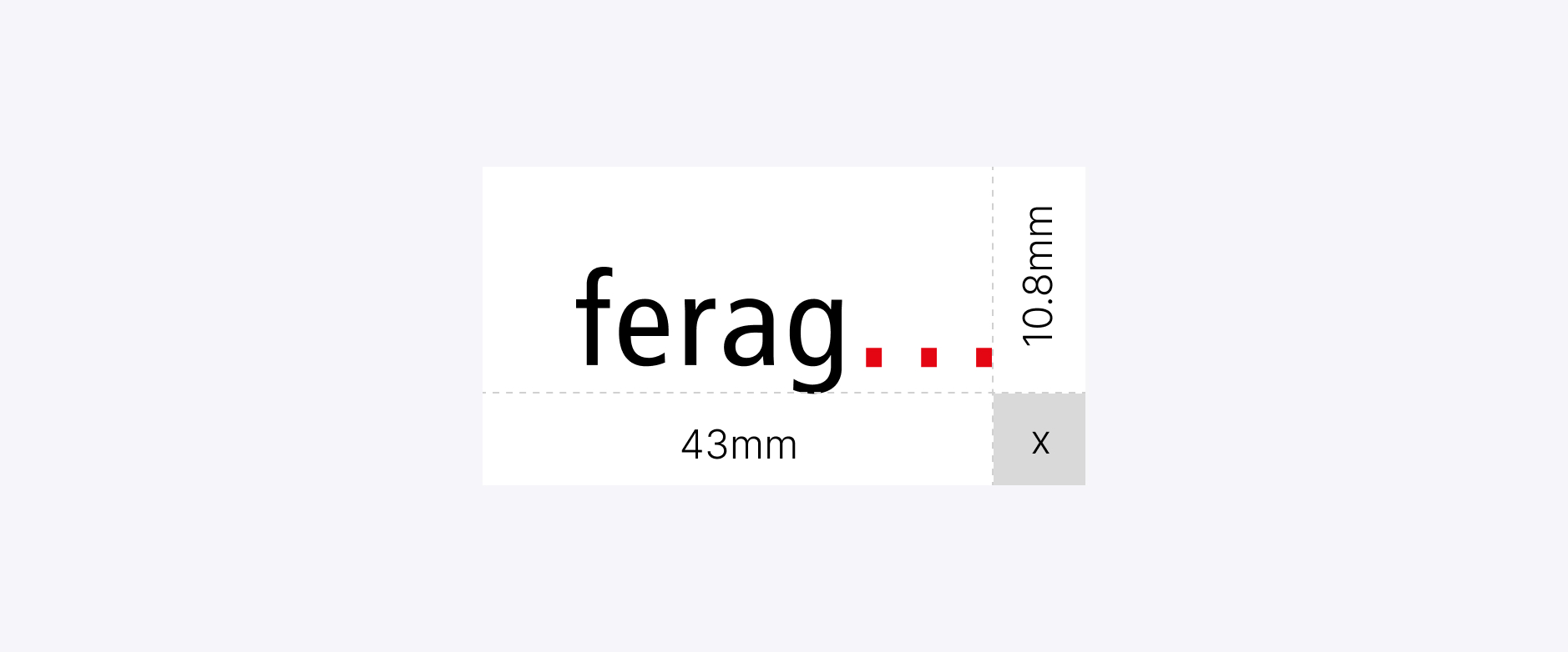
General formats and sizes: DIN A4/A5
05 Protected area
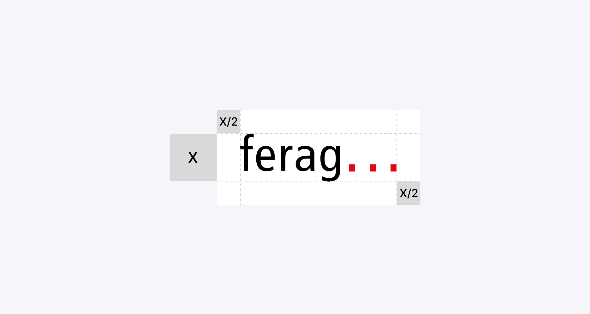
Application: Format up to DIN A6 (In each case in consultation)
06 Digital Sizes
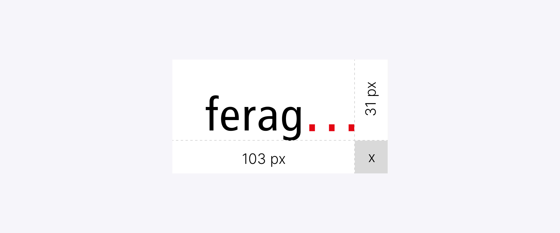
Allowable minimum size shown on digital screens
07 Do’s & Don’ts Wordmark
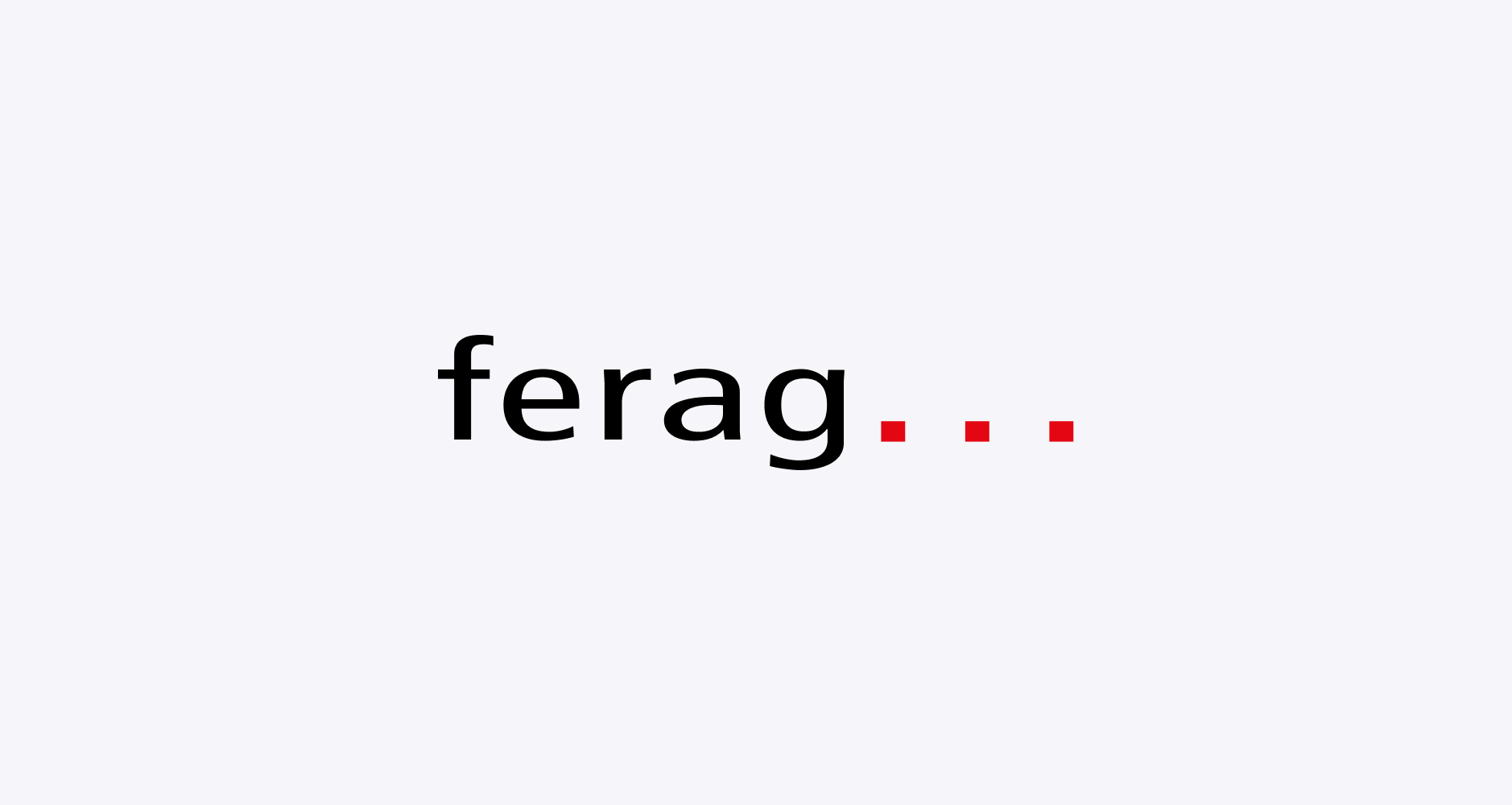
❌ Do not stretch
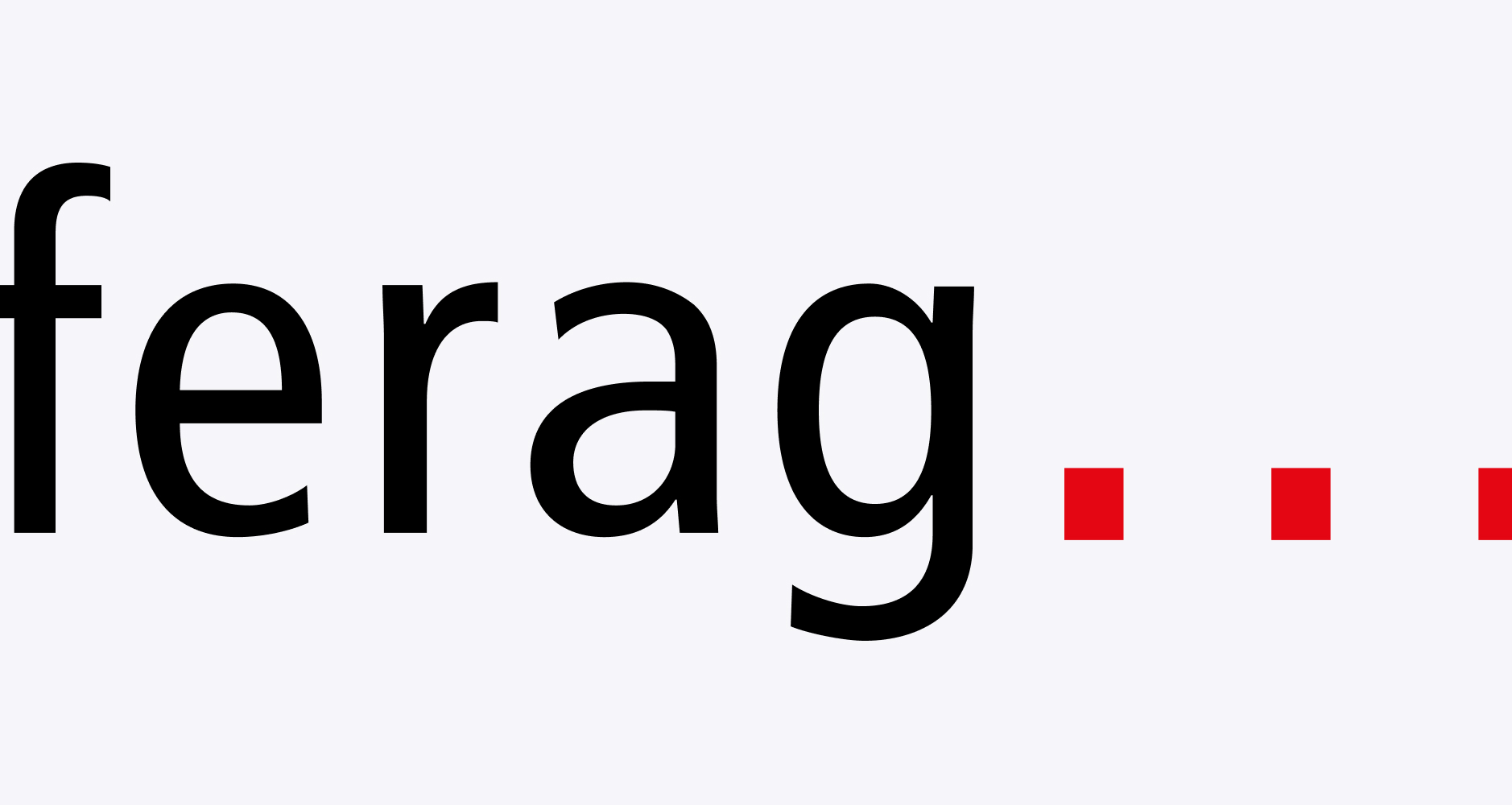
❌ Do not crop
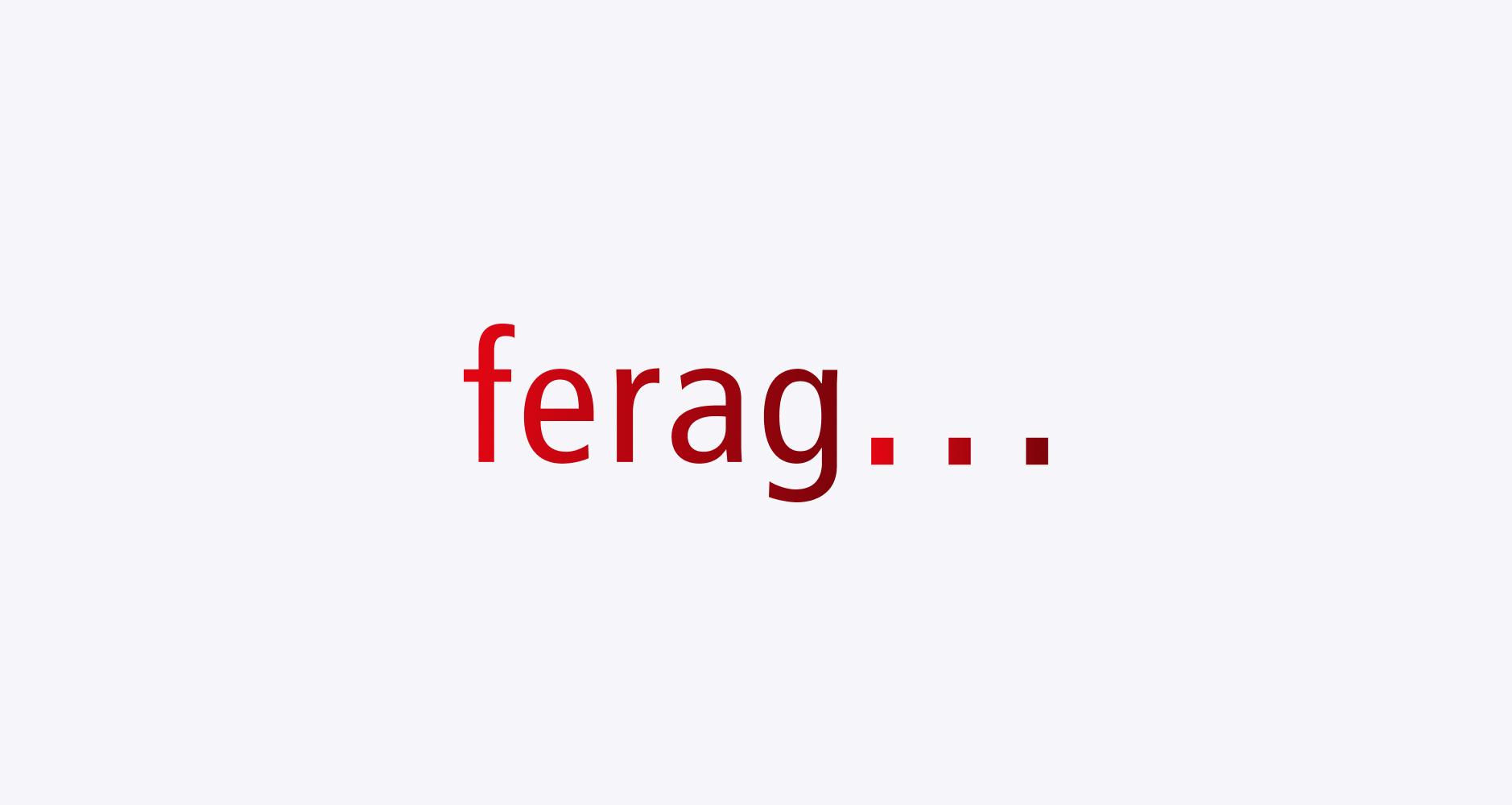
❌ Do not use effects & gradients
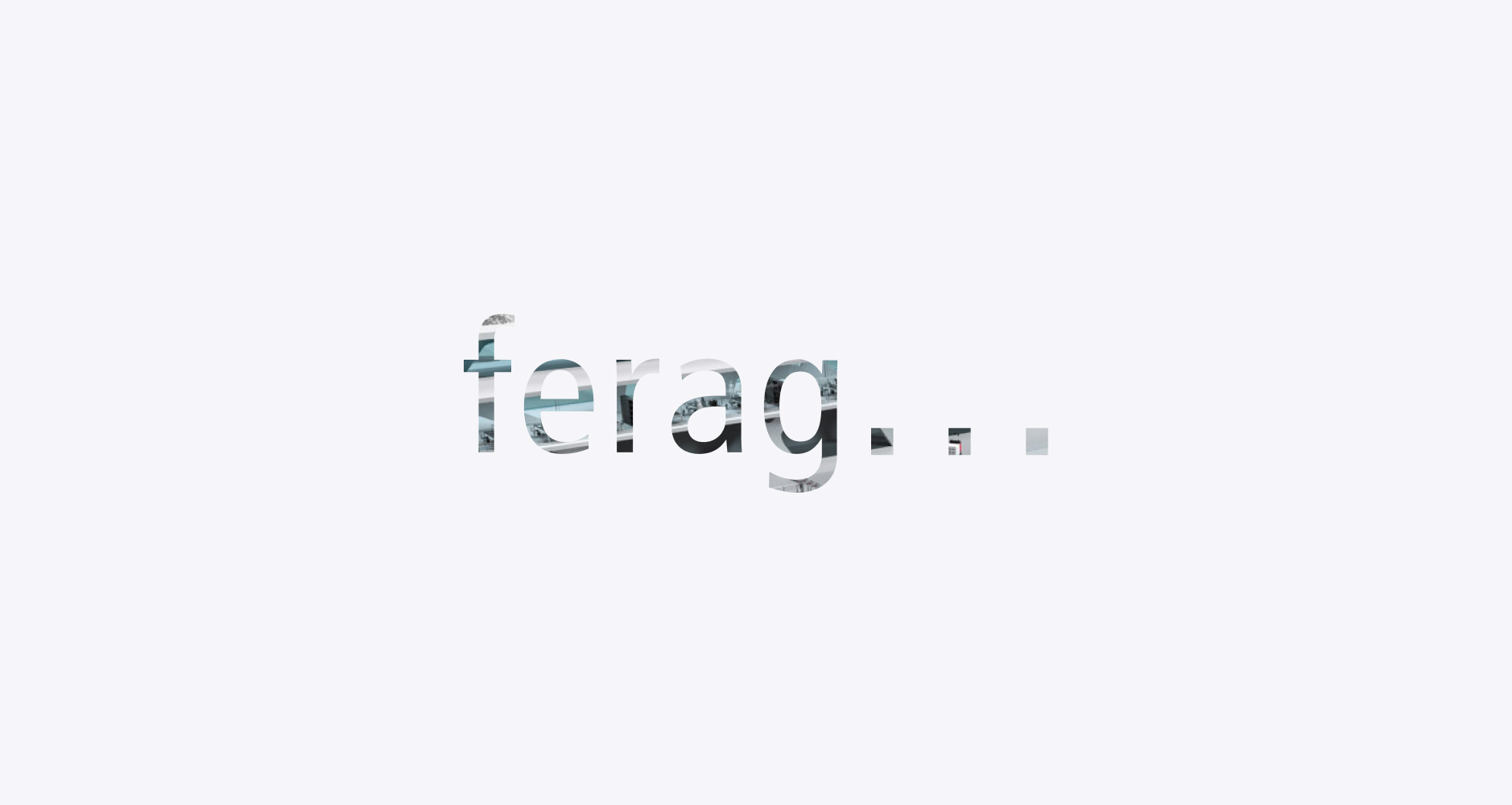
❌ Do not use as a mask
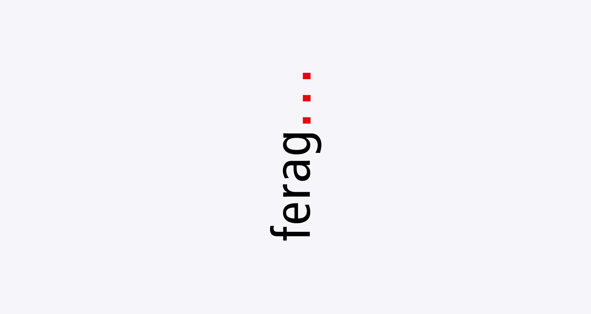
❌ Do not rotate the logo
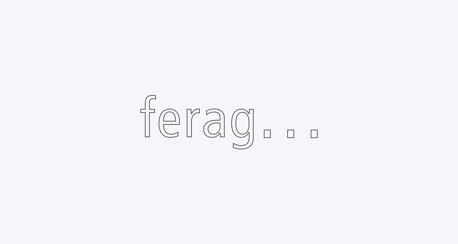
❌ Do not outline the logo
Favicon
01 Usage
Primary

Primary use: With ferag logo repetitions the ferag logo at the same position by the ferag logo icon in the same position Ex: PPT, style guide, as Icon on digital channels or tools (LinkedIn profile)
02 Protected Area
A6
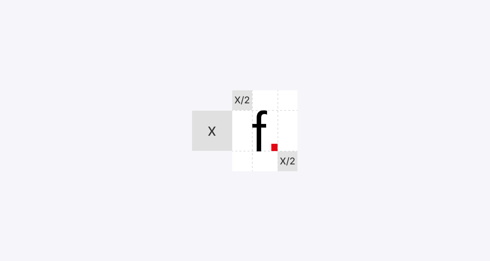
Application: Format up to DIN A6 (In each case in consultation)
03 Application
Social media profile, Website address bar Examples of use are shown in the Style Guide in the section
Secondary
Secondary use Version 4C square
Secondary use Version 4C circle
Tagline
01 Ferag Solutions Tagline
‘Lowest Cost of Order Fulfillment’
Meaning: For customers, the entire logistics cost structure required to process one unit from inbound to outbound.
At its core, “The true benchmark for profitability in the fulfillment process. Not just what technology costs, but what it delivers.”
Our tagline for Solutions
02 Ferag Technologies Tagline
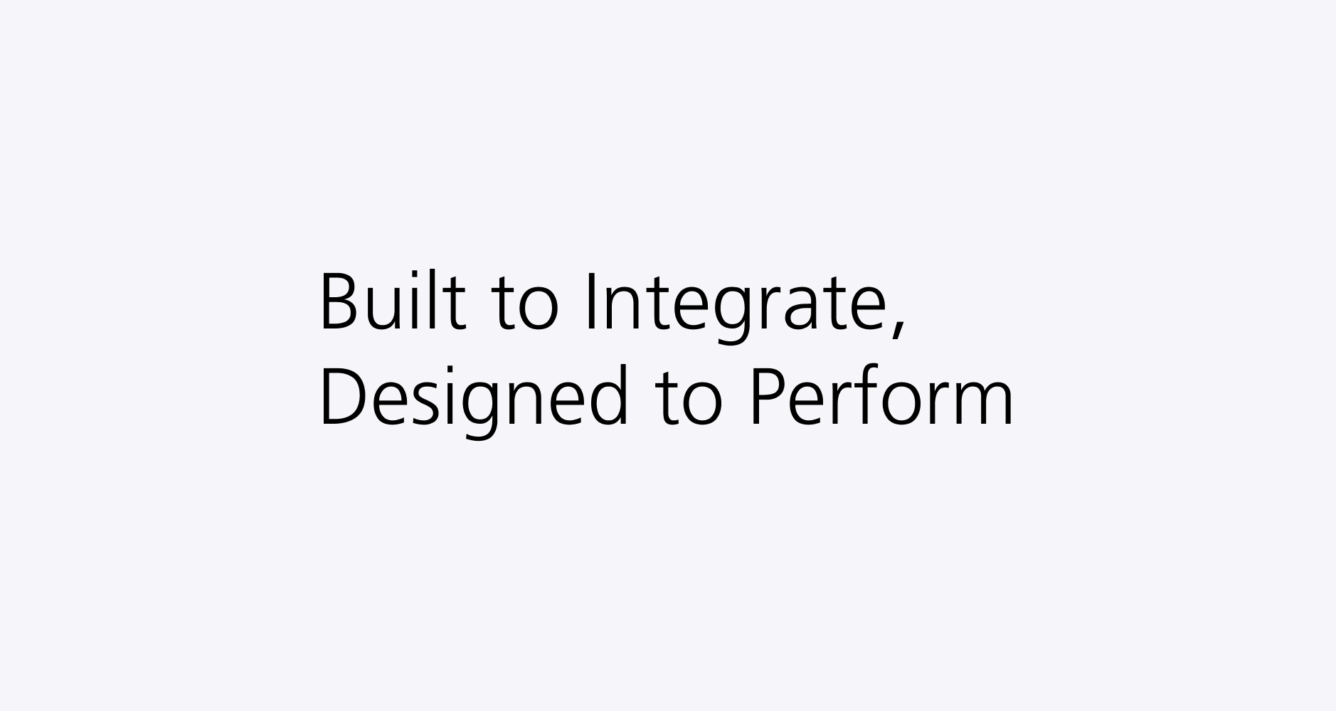
‘Built to Integrate, Designed to Perform’
Meaning: Trusted partner for automation systems and lifecycle services
At its core, Ferag Technologies develops bespoke, integration ready automation solutions supported by end-to-end lifecycle services that ensure reliable implementation, long term performance and scalable growth.
Our tagline for Technologies
Reist Symbol
01 The Reist Symbol
The Reist symbol is a visual model of how Ferag once understood and shaped its internal organization. Developed in the early days of the company, it’s not a logo or a decorative element — but a symbol of entrepreneurial thinking and responsibility.
The Reist symbol is made up of three nested elements:
- A sphere at the center
- A ring around it
- And an outer circle
Each part has a specific meaning:
- The sphere (core): Represents company leadership. It sends and receives impulses — ideas, decisions, and direction.
- The ring (middle layer): Represents decision-makers and coordination. It connects strategy and execution.
- The outer circle: Represents all employees. It is where decisions become action and where Ferag meets the outside world.
The symbol also reflects the company’s three central domains:
- Technical (engineering, systems)
- Financial (economic decisions, resources)
- People (collaboration, leadership, culture)
It visualizes how these areas are interconnected – like spokes radiating from the center – and how independent units or “cells” operate with a high degree of autonomy and mutual alignment.
At its heart, the Reist symbol promotes:
- Clarity and structure
- Entrepreneurial spirit
- A sense of community across all levels
Usage Guideline
While the Reist symbol is respected as part of our heritage, it is not part of Ferag’s current corporate design.
It must not be used in:
- Marketing materials (ads, brochures, presentations, websites)
- Visual or digital brand content of any kind
It may be used only in business documents, and only in this specific context:
- As part of the sender line next to the registered company name (e.g. Ferag AG)
This approach ensures that we:
- Preserve our roots while focusing forward
- Maintain a clear, modern, and unified brand
- Honor the thinking behind the Reist symbol — but use it only where it truly fits
Questions? Contact Us

Learn more on Ferag Typography


Logo guidelines
This guide contains our wordmark, favicon and WRH symbol and its applications. How-to, examples in use and co-branding are detailed in the link below.
Tagline
01
Wordmark
Overview
At Ferag, our brand is more than just a logo or color palette. It’s the visual and emotional expression of who we are, where we come from, and what we stand for across countries, cultures, and industries.
Every presentation, email, brochure, or exhibition stand is an opportunity to make Ferag recognizable, trustworthy, and inspiring. That’s why our Corporate Identity (CI) and Corporate Design (CD) are not just design rules, they are tools for consistency, credibility, and pride.
Following our brand guidelines is not just a marketing task, it’s a shared responsibility. It strengthens our message, supports our employer brand, and shows the world that we’re one team, working with one voice.
01 Logo
The name Ferag is formed from the founders’ original company name: Fehr and Reist AG. It reminds us of our roots while standing today for:
- Swiss engineering excellence
- Innovative intralogistics solutions
- Trust, reliability, and forward-thinking
Our visual identity consists of two core elements:
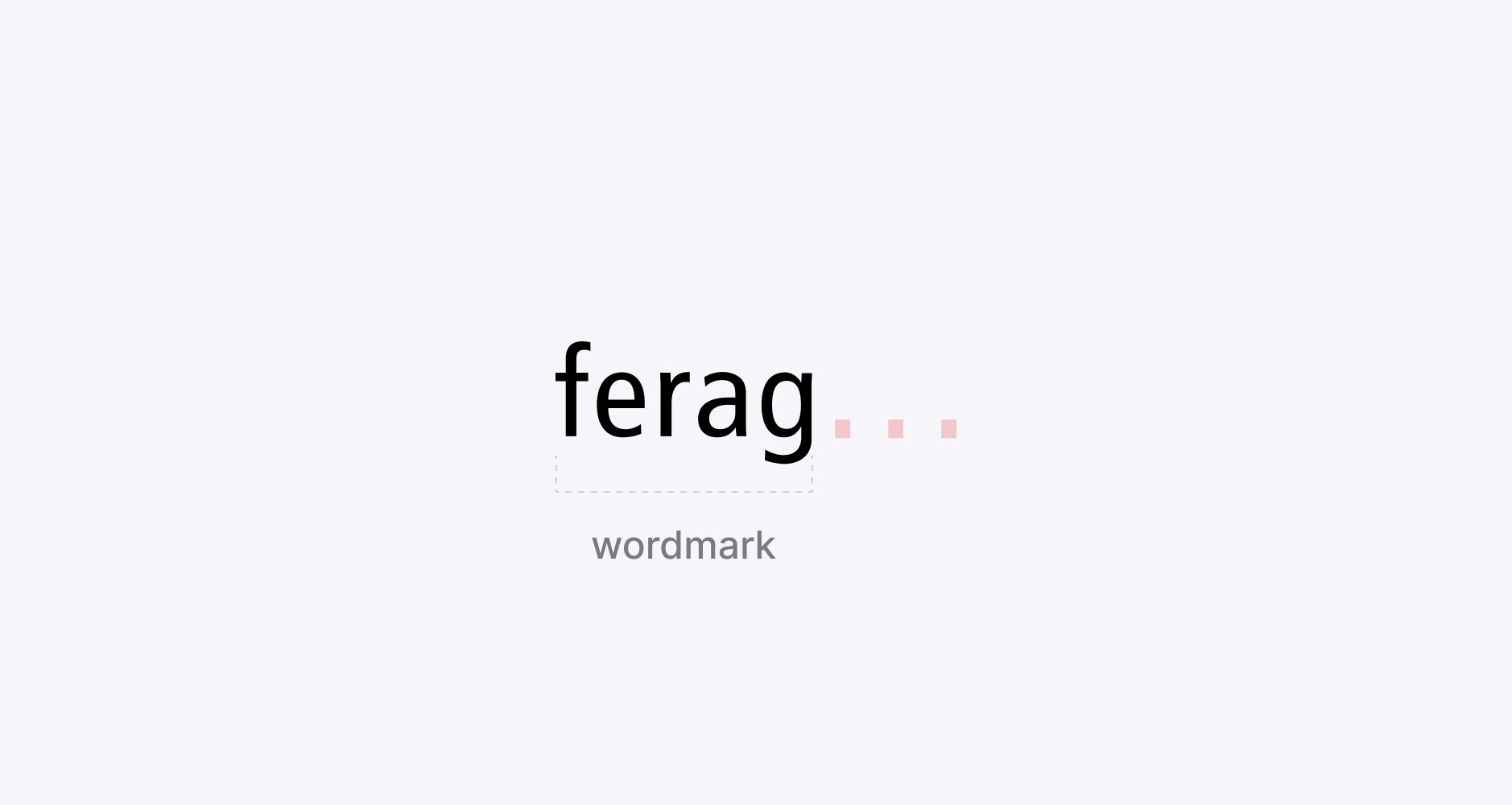
Set in the Frutiger typeface, a world-renowned font designed by Swiss typographer Adrian Frutiger. This clean, modern typeface symbolizes Swiss precision, clarity, and quality.
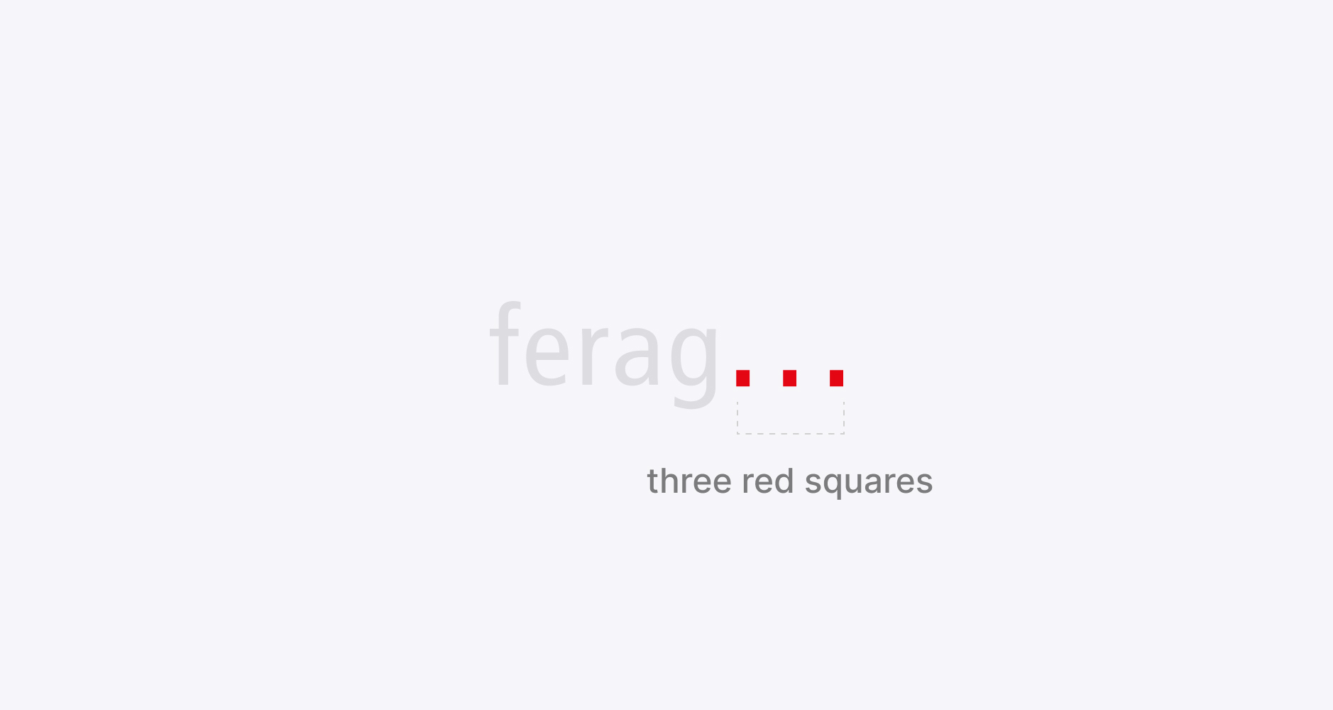
They represent our values and communicate a powerful message, both externally and internally:
- External: Performance, Progress, Value
- Internal: People, Technology, Finance
02 Usage
The Ferag wordmark and favicon must be used consistently across all documents and materials. This strengthens our group brand identity and reinforces Ferag as a unified company with three integrated legal entities under one strong umbrella.
Use of Legal Entity Names (e.g., Ferag Technologies, Ferag Solutions, Ethon Advisory)
The names of the legal entities (e.g. Ferag Technologies, Ferag Solutions, Ethon Advisory) are not to be used as standalone logos or visual identifiers.
Position: top right
The logo may only be placed elsewhere in the document in consultation with Group Marketing.
Primary
Primary Use: Version 4C
03 Special Application
For matte and glossy finishes
Primary use: For white matt (or glossy) background, the ferag.logo lettering, the three dots remain red in white glossy (or matte) white.
Primary use: For black matt (or glossy) background, the ferag.logo lettering, the 3 dots remain red, in black glossy (or matt) black.
04 Scaled Sizes (print)
DIN A4/A5
General formats and sizes: DIN A4/A5
05 Protected area
Application: Format up to DIN A6 (In each case in consultation)
06 Digital Sizes
Allowable minimum size shown on digital screens
07 Do’s & Don’ts Wordmark
❌ Do not stretch
❌ Do not crop
❌ Do not use effects & gradients
❌ Do not use as a mask
❌ Do not rotate the logo
❌ Do not outline the logo
Favicon
01 Usage
Primary
Primary use: With ferag logo repetitions the ferag logo at the same position by the ferag logo icon in the same position Ex: PPT, style guide, as Icon on digital channels or tools (LinkedIn profile)
02 Protected Area
A6
Application: Format up to DIN A6 (In each case in consultation)
03 Application
Social media profile, Website address bar Examples of use are shown in the Style Guide in the section
Secondary
Secondary use Version 4C square
Secondary use Version 4C circle
Tagline
01 Ferag Solutions Tagline
‘Lowest Cost of Order Fulfillment’
Meaning: For customers, the entire logistics cost structure required to process one unit from inbound to outbound.
At its core, “The true benchmark for profitability in the fulfillment process. Not just what technology costs, but what it delivers.”
Our tagline for Solutions
02 Ferag Technologies Tagline
‘Built to Integrate, Designed to Perform’
Meaning: Trusted partner for automation systems and lifecycle services
At its core, Ferag Technologies develops bespoke, integration ready automation solutions supported by end-to-end lifecycle services that ensure reliable implementation, long term performance and scalable growth.
Our tagline for Technologies
Reist Symbol
01 The Reist Symbol
The Reist symbol is a visual model of how Ferag once understood and shaped its internal organization. Developed in the early days of the company, it’s not a logo or a decorative element — but a symbol of entrepreneurial thinking and responsibility.
The Reist symbol is made up of three nested elements:
- A sphere at the center
- A ring around it
- And an outer circle
Each part has a specific meaning:
- The sphere (core): Represents company leadership. It sends and receives impulses — ideas, decisions, and direction.
- The ring (middle layer): Represents decision-makers and coordination. It connects strategy and execution.
- The outer circle: Represents all employees. It is where decisions become action and where Ferag meets the outside world.
The symbol also reflects the company’s three central domains:
- Technical (engineering, systems)
- Financial (economic decisions, resources)
- People (collaboration, leadership, culture)
It visualizes how these areas are interconnected – like spokes radiating from the center – and how independent units or “cells” operate with a high degree of autonomy and mutual alignment.
At its heart, the Reist symbol promotes:
- Clarity and structure
- Entrepreneurial spirit
- A sense of community across all levels
Usage Guideline
While the Reist symbol is respected as part of our heritage, it is not part of Ferag’s current corporate design.
It must not be used in:
- Marketing materials (ads, brochures, presentations, websites)
- Visual or digital brand content of any kind
It may be used only in business documents, and only in this specific context:
- As part of the sender line next to the registered company name (e.g. Ferag AG)
This approach ensures that we:
- Preserve our roots while focusing forward
- Maintain a clear, modern, and unified brand
- Honor the thinking behind the Reist symbol — but use it only where it truly fits
Questions? Reach out to franziska.graf@ferag.com
Learn more on Ferag Typography

Logo guidelines
This guide contains our wordmark, favicon and WRH symbol and its applications. How-to, examples in use and co-branding are detailed in the link below.
Wordmark
Overview
At Ferag, our brand is more than just a logo or color palette. It’s the visual and emotional expression of who we are, where we come from, and what we stand for across countries, cultures, and industries.
Every presentation, email, brochure, or exhibition stand is an opportunity to make Ferag recognizable, trustworthy, and inspiring. That’s why our Corporate Identity (CI) and Corporate Design (CD) are not just design rules, they are tools for consistency, credibility, and pride.
Following our brand guidelines is not just a marketing task, it’s a shared responsibility. It strengthens our message, supports our employer brand, and shows the world that we’re one team, working with one voice.
01 Logo
The name Ferag is formed from the founders’ original company name: Fehr and Reist AG. It reminds us of our roots while standing today for:
- Swiss engineering excellence
- Innovative intralogistics solutions
- Trust, reliability, and forward-thinking
Our visual identity consists of two core elements:
Set in the Frutiger typeface, a world-renowned font designed by Swiss typographer Adrian Frutiger. This clean, modern typeface symbolizes Swiss precision, clarity, and quality.
They represent our values and communicate a powerful message, both externally and internally:
- External: Performance, Progress, Value
- Internal: People, Technology, Finance
02 Usage
The Ferag wordmark and favicon must be used consistently across all documents and materials. This strengthens our group brand identity and reinforces Ferag as a unified company with three integrated legal entities under one strong umbrella.
Use of Legal Entity Names (e.g., Ferag Technologies, Ferag Solutions, Ethon Advisory)
The names of the legal entities (e.g. Ferag Technologies, Ferag Solutions, Ethon Advisory) are not to be used as standalone logos or visual identifiers.
Position: top right
The logo may only be placed elsewhere in the document in consultation with Group Marketing.
Primary
Primary Use: Version 4C
03 Special Application
For matte and glossy finishes
Primary use: For white matt (or glossy) background, the ferag.logo lettering, the three dots remain red in white glossy (or matte) white.
Primary use: For black matt (or glossy) background, the ferag.logo lettering, the 3 dots remain red, in black glossy (or matt) black.
04 Scaled Sizes (print)
DIN A4/A5
General formats and sizes: DIN A4/A5
05 Protected area
Application: Format up to DIN A6 (In each case in consultation)
06 Digital Sizes
Allowable minimum size shown on digital screens
07 Do’s & Don’ts Wordmark
❌ Do not stretch
❌ Do not crop
❌ Do not use effects & gradients
❌ Do not use as a mask
❌ Do not rotate the logo
❌ Do not outline the logo
Favicon
01 Usage
Primary
Primary use: With ferag logo repetitions the ferag logo at the same position by the ferag logo icon in the same position Ex: PPT, style guide, as Icon on digital channels or tools (LinkedIn profile)
02 Protected Area
A6
Application: Format up to DIN A6 (In each case in consultation)
03 Application
Social media profile, Website address bar Examples of use are shown in the Style Guide in the section
Primary
Primary use Version 1C square (Single colour use)
Primary use Version 1C circle (Single colour use)
Tagline
01 Ferag Solutions Tagline
‘Lowest Cost of Order Fulfillment’
Meaning: For customers, the entire logistics cost structure required to process one unit from inbound to outbound.
At its core, “The true benchmark for profitability in the fulfillment process. Not just what technology costs, but what it delivers.”
Our tagline for Solutions
02 Ferag Technologies Tagline
‘Built to Integrate, Designed to Perform’
Meaning: Trusted partner for automation systems and lifecycle services
At its core, Ferag Technologies develops bespoke, integration ready automation solutions supported by end-to-end lifecycle services that ensure reliable implementation, long term performance and scalable growth.
Our tagline for Technologies
Reist Symbol
01 The Reist Symbol
The Reist symbol is a visual model of how Ferag once understood and shaped its internal organization. Developed in the early days of the company, it’s not a logo or a decorative element — but a symbol of entrepreneurial thinking and responsibility.
The Reist symbol is made up of three nested elements:
- A sphere at the center
- A ring around it
- And an outer circle
Each part has a specific meaning:
- The sphere (core): Represents company leadership. It sends and receives impulses — ideas, decisions, and direction.
- The ring (middle layer): Represents decision-makers and coordination. It connects strategy and execution.
- The outer circle: Represents all employees. It is where decisions become action and where Ferag meets the outside world.
The symbol also reflects the company’s three central domains:
- Technical (engineering, systems)
- Financial (economic decisions, resources)
- People (collaboration, leadership, culture)
It visualizes how these areas are interconnected – like spokes radiating from the center – and how independent units or “cells” operate with a high degree of autonomy and mutual alignment.
At its heart, the Reist symbol promotes:
- Clarity and structure
- Entrepreneurial spirit
- A sense of community across all levels
Usage Guideline
While the Reist symbol is respected as part of our heritage, it is not part of Ferag’s current corporate design.
It must not be used in:
- Marketing materials (ads, brochures, presentations, websites)
- Visual or digital brand content of any kind
It may be used only in business documents, and only in this specific context:
- As part of the sender line next to the registered company name (e.g. Ferag AG)
This approach ensures that we:
- Preserve our roots while focusing forward
- Maintain a clear, modern, and unified brand
- Honor the thinking behind the Reist symbol — but use it only where it truly fits
Questions? Reach out to franziska.graf@ferag.com
Learn more on Ferag Typography
